How to Make Data Visualization Better with Gestalt Laws - Six Revisions |
| How to Make Data Visualization Better with Gestalt Laws Posted: 15 Jul 2013 03:00 AM PDT
People love order. We love to make sense of the world around us. The human mind’s affinity for making sense of the objects it sees can be explained in a theory called Gestalt psychology. Gestalt psychology, also referred to gestaltism, is a set of laws that accounts for how we perceive or intuit patterns and conclusions from the things we see.
These laws can help designers produce better designs. For instance:
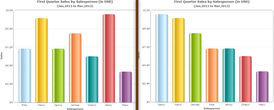
In this guide, we will talk about how to apply the principles of Gestalt to create better charts, graphs, and data visualization graphics. For broader implementation tips of Gestalt laws, please read Gestalt Principles Applied in Design. IntroductionGestalt laws originate from the field of psychology. Today, however, this set of laws finds relevance in a multitude of disciplines and industries like design, linguistics, musicology, architecture, visual communication, and more. These laws provide us a framework for explaining how human perception works. Understanding and applying these laws within the scope of charting and data visualization can help our users identify patterns that matter, quickly and efficiently. None of the Gestalt laws work in isolation, and in any given scenario, you can find the interplay of two or more of these laws. Let us cover some of the Gestalt laws that are relevant to enhancing data visualization graphics. Gestalt Law of PrägnanzThe law of Prägnanz is the central law of Gestalt. Prägnanz is a German word that means "pithiness." Pithiness is the act of being concise and full of meaning/substance. The law of Prägnanz states that the human brain loves simplicity and it tends to process simple patterns — patterns that are regular, even, and orderly — faster than patterns that are more complex. Let’s say you want to identify the top performer of the quarter from a "Sales by Salesperson" chart. Look below to see which of the two charts is easier to use: The one in which the data is disorganized (left) or the chart which has ordered the data from highest sales to lowest (right):
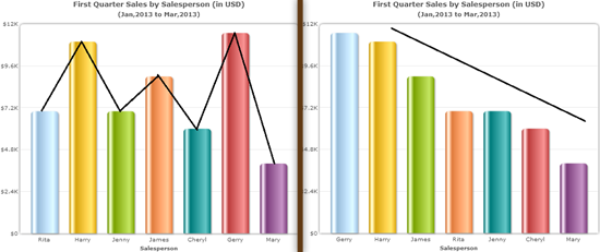
Lesson: Arrange data logically and systematically at every opportunity. Gestalt Law of ContinuityThe law of continuity states that our eyes instinctively group things that are aligned with each other. Let’s go back to our "Sales by Salesperson" chart example. In the left chart below, there are abrupt directional changes. In the chart on the right below, the eyes follow a continuous path; it makes the whole chart more readable because of the continuous downward direction.
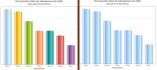
Lesson: Align elements linearly to facilitate comparison of different items that are in a related grouping. Gestalt Law of SimilarityThis Gestalt law theorizes that objects with similar characteristics — similar colors, similar shapes, similar sizes, similar orientation, etc. — are perceived as a group. Let’s see how we can apply this to our "Sales by Salesperson" chart example. We can find the top performer using the first chart easily because we used the laws of Prägnanz and Continuity. However, we can improve the design a bit more by using the Gestalt law of Similarity. In the chart on the right, we have made the bar graphs all the same color — they are all the same light blue color. Giving them the same color removes the additional cognitive load imposed by the disruptive use of varying colors in the chart on the left, and makes it much easier for us to compare and find points of interest.
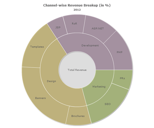
Notice how the multi-level pie chart below uses color to group related entities and differentiate them from other groupings:
Lesson: Use similar characteristics and attributes (color, size, shape, etc.) to establish relationships between objects and to reinforce groupings. Gestalt Law of Focal PointWhat’s the inverse of the law of Similarity? The law of Focal Point. The law of Focal Point states that in a visual presentation, distinctive objects create a focal point. The focal point stands apart from other objects, draws the user’s attention, and persuades him to delve further into the presentation with the focal point as the starting point of the exploration. Let’s again go back to our "Sales by Salesperson" chart example. (You are probably bored of this chart by now!) Say that, for some reason, you want James (a salesperson represented in our chart) to be highlighted. Perhaps you want to highlight James’s performance because he is the subject of conversation in your staff meeting. Or because, compared to the other salespeople in our chart, he’s doing incredibly well because he just started a month ago and he’s already our top 3 performer. (Good job James!) By changing James’s bar graph color, see how your eyes are drawn to his bar graph immediately, even though there are two other top-performers prior to his bar graph:
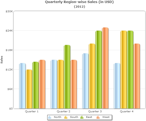
In the chart on the right, the bar graph for James stands out due to its distinctive color — it makes James’s bar graph the focal point of the chart. Lesson: Use the art of distinction to highlight and create a focal point in your graphs and charts. Gestalt Law of ProximityThis law states that objects placed close to one another are perceived as a group. We easily tend to make comparisons and look for similarities in such groups. Objects that are further apart are seen as unrelated or less related. Let us look at the law of Proximity in action. In the following chart, the sales of "North", "South", "East", and "West" regions form 4 distinct groups: "Quarter 1", "Quarter 2", "Quarter 3", and "Quarter 4". It is quite easy to compare the sales of each region within a quarter (which is our grouping according to the law of Proximity) due to their proximity with one another.
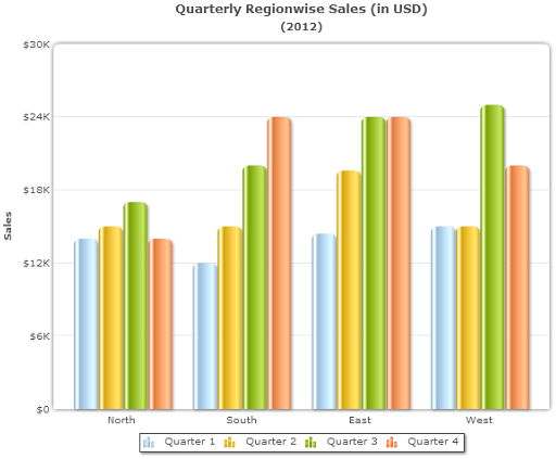
But try comparing the sales of the "North" region (blue bar graphs) across the 4 quarters. Difficult isn’t it? Let’s revise our chart by employing the law of Proximity:
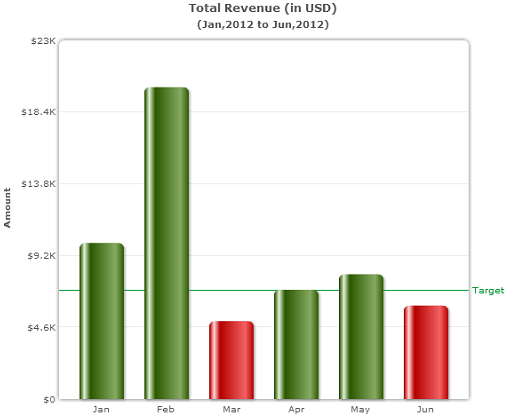
Now try to find and compare the sales of the "North" region (and other regions) across the quarters using the revised chart. It should now be easier. Lesson: Know what your chart wants to focus on. Keep those data points close to each other by grouping them according to your established information priority. Gestalt Law of Isomorphic CorrespondenceThis law states that people interpret and respond to images based on their past experiences. This law, for instance, explains why sticking to well-established user interface conventions, like blue-and-underlined hyperlinks in web pages, is effective. One application of this law in the realm of data visualization is in the selection of colors for your charts. For example, many cultures and nations associate the color of red with "danger" or "stop", and green with "growth" or "nature". When creating charts that have positive/negative connotations (e.g. profit/loss charts and revenue charts), you can color code your chart accordingly — green for positive and red for negative. (This is a popular charting convention in the business world that people are accustomed to.) In the "Total Revenue" graph below notice how — due to the colors used for the bar graphs — the user quickly gets the idea that the revenues were below the target revenue for two months with minimal inspection of the graph.
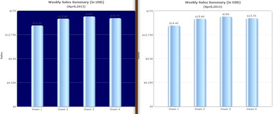
Lesson: Keep in mind your users and their preconceived notions and past experiences; stick to popular conventions and best practices if possible. Gestalt Law of Figure/GroundThis law states that objects of a graphic either are perceived as figures (distinct elements of focus) or as ground (the background on which the figures rest). Foreground objects are important. Background objects are less important. Web designers should already be familiar with the concept of the Figure/Ground law. The more the contrast between the figure and the ground, the easier it will be to distinguish between the two types of objects. Below, which chart do you find more readable?
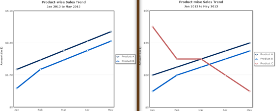
Due to the low contrast between the figure and background in the chart on the left, there is an additional cognitive load. Increasing the contrast (as in the chart on the right), improves readability. Lesson: Ensure there is enough contrast between your figures and ground. Gestalt Law of Common FateThis law states that when lines or shapes move together in the same direction, they create a sense of unity and indicate a relationship. They share a common fate. On the other hand, when lines or shapes move in different directions, they are perceived as unrelated or less related. Below, in the chart on the left, the data plot for "Product A" and "Product B" appear to move together and facilitate a grouping. In the chart on the right, the plot for "Product C" is moving in a different direction so "Product C" is thus perceived as different and unrelated.
Lesson: Use direction and/or movement to establish or negate relationships. SummaryTo sum up the lessons we can derive from these Gestalt laws:
Learn More about Applying Gestalt to Design
Note: Charts and graphs in this guide were created using FusionCharts Suite XT. Related Content
About the Authors
The post How to Make Data Visualization Better with Gestalt Laws appeared first on Six Revisions. |


| You are subscribed to email updates from Six Revisions To stop receiving these emails, you may unsubscribe now. | Email delivery powered by Google |
| Google Inc., 20 West Kinzie, Chicago IL USA 60610 | |
No comments:
Post a Comment