What Your Website’s Design Says About You - Six Revisions |
| What Your Website’s Design Says About You Posted: 03 Jun 2013 03:00 AM PDT As web designers, we know that our work speaks to our users. It’s that reason why we go about our work so deliberately; we choose colors, fonts, the type of web layout we’re going to use, and even the way we write CSS, all in a very purposeful manner. As we craft our designs, we also realize that the result will say something about us, the designer. And these things that our designs are saying are not always good.
So whenever you’re building a website design, ask yourself this: What is it saying about me? Modal Window Ads = Money Matters More than UX and ContentSo many sites have opted for modal window/lightbox ads, which seems to be the modern form of pop-up window ads. And — just like their predecessor, the pop-up window ads — modal window ads are very annoying. Modal window advertisement is a very intrusive strategy that unpleasantly interrupts and affects the user experience.
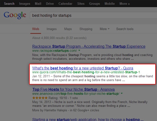
If your users have to work hard to get to the content they’ve come to your site to read, you’re doing it wrong. Your design should say to the user that the primary priority is her experience, and also that your content is the most important aspect of your site. By interrupting, delaying, and otherwise making your users jump through hoops to get to your content, you’re telling them that they rank below the greater priority of monetizing your site. In the same vein, anything that forces users to sign up, log in, put in their email, etc. just so they can access your content, should be reconsidered. Imagine that you’re in this scenario: You’re desperately looking for a new web host for your startup because your current web host isn’t scaling to your needs. It just keeps crashing-and-burning, which tells you that you’ve outgrown your current solution (congratulations on your startup’s growth, by the way). Like most tech entrepreneurs, your initial problem-solving action is to Google search for the new web host for your startup. You happen to come across a timely thread on Quora, a site you know is frequented by smart tech entrepreneurs like yourself.
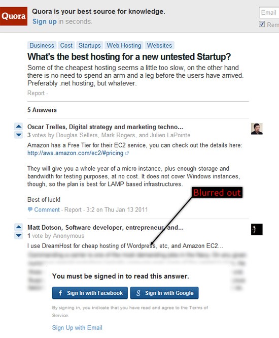
You get very excited because, within seconds, you’re off to a good start! You ask yourself, "No way, it can’t be this easy, can it?" You decide to check the Quora thread out. Yep, it turns out that it’s really not that easy (even though it should be). Sadly, you realize that the web page requires you to connect your Facebook account or else you won’t be able to see all the content that you’ve gone to the site for.
If you choose not to sign in with your Facebook or Google account, only the first answer thread is shown. The rest of the thread is frustratingly blurred out. What a slap in the face.
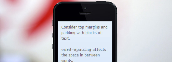
If that was your first time on the site — and the first thing they do to you is purposefully obscure the content you came for — wouldn’t that leave a terrible impression on you? Getting our users the content they ask for as quickly as possible should be our first priority as web designers. Anything that works against that goal should be cut out from our designs. There are plenty of other less obtrusive ways to display ads. There are design strategies, for example, that give users a choice of whether they want to interact with an ad or not — or at least a choice of quickly skipping/ignoring them — such as banner ads on the sidebar. Lack of Web Accessibility = Not All People Matter to YouWeb accessibility needs to be more widely embraced by the web design industry. We need to focus our scope of web design innovation on all users, not just the users with expensive touch-screen smartphones. Web accessibility goes beyond just those with disabilities. People on older mobile devices or those with poor internet connectivity — the average global internet speed is only 2.9Mbps, less than half of U.S. average speed — also need to be included. Unless you want your website’s design to give off the impression that certain users matter to you more than others, then you want to have it crafted with good web accessibility features. Most web accessibility site features are relatively easy to implement and are already a part of good web design best practices. While there are many of us who would exclude users of a certain browser (like deliberately choosing not to support Internet Explorer 6 anymore) it’s not fair to punish users for something they aren’t able to control (such as color blindness). Insufficient White Space = Readability of Content Doesn’t MatterOne thing that I see a lot of around the Internet (outside of web design galleries, of course) is the lack of sufficient white space around content and images. White space is a powerful design tool. White space can spell the difference between making your content presentation pleasurable and easier to read or cramped and visually uncomfortable. With content being king, we should take the (often very little) time to ensure that it gets the best form of delivery possible. For the purpose of illustration, look at how hard it is to read the block of text below:
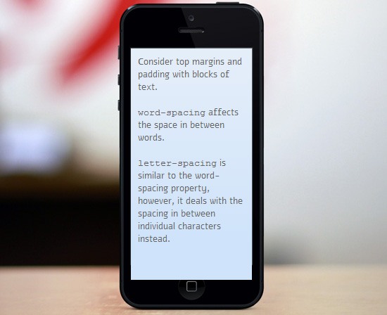
It’s hard to read because of poor letter-spacing, line-height, padding/gutters, and margin property values. These are very easy issues to fix, if your CSS typography knowledge is up to speed. Within seconds, and with just a tad bit of padding, margin, and line-height property value adjustments, the same block of text becomes better in terms of legibility. The text is more pleasurable to read:
Your content is worth reading. Ensure that your message isn’t lost because of poor white spacing. Here’s a list of articles and guides to read. They all discuss the strategic use of white space in web design:
Useful 404 Error Pages = You Care About Keeping Users on the SiteMistakes in entering the correct URL are made often. Some inbound links to your content may no longer exist, or may have been moved. Sometimes, certain web pages on your site just stop working because of technical issues. For events like these, we need to create and design a useful 404 error page — a page that doesn’t just restate what the user already knows (which is that they’ve lost their way). Some basic tips for designing useful error pages:
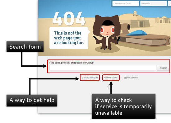
This is GitHub’s 404 error page (a good example of a useful 404 error page):
What makes GitHub’s error page useful?
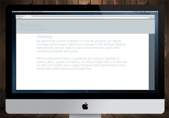
If you don’t take steps to help users find the content they seek, then you’re just telling them that they should just go to another website to find it. Poor Background/Foreground Contrast = Aesthetics Mean More than LegibilityNot providing enough color contrast between the background and the foreground is bad news for many users with low vision. What it says to your site visitors is that you have fallen prey to form over function mentality — that you care more about how the site and design looks over the actual content of the site itself. Here’s an example of what poor color contrast does to legibility:
With just a few minor CSS tweaks — in this case, just changing the color property values of the <h1> and <p> elements — you can make the reading experience a bit better:
While there are tools like Readability that will help your users take care of these issues for you, it’s your responsibility as a web designer to provide that easy reading experience to begin with.
Take as much care as you can in creating a comfortable, visually pleasing content presentation. This encourages site visitors to consume whatever content you’re offering. If you’re concerned that your website’s design lacks enough color contrast, these articles are worth a read:
No Engagement Features = Not Interested in What Users Have to SayProviding methods for your users to be able to contact you says that you care deeply about their experience on your site. You’re saying that you value their feedback, whether it’s negative or positive. Be it a commenting system, contact form, email, social networks, your help and support forums, a live chat widget — having these user engagement tools will show that you want to hear from them.
If you’re not providing them with opportunities of contacting you, then you’re effectively telling people that you don’t care about what they have to say. User feedback is critical for fine-tuning and developing the UI and UX of your website, so keep your lines of communication open. What Do You Say?It’s your turn. What do you have to say about this article? Share it with us in the comments section below! Related Content
About the Author |
| You are subscribed to email updates from Six Revisions To stop receiving these emails, you may unsubscribe now. | Email delivery powered by Google |
| Google Inc., 20 West Kinzie, Chicago IL USA 60610 | |






No comments:
Post a Comment