5 Usability Mistakes You Shouldn’t Make - Six Revisions |
| 5 Usability Mistakes You Shouldn’t Make Posted: 24 Jun 2013 03:00 AM PDT No web designer sets out to create a terrible user experience. And a terrible user experience usually isn’t just one thing — it’s dozens of tiny usability mistakes repeated all throughout the user interface that coalesce into one big, frustrating experience. Let’s go over some usability mistakes that will frustrate your users.
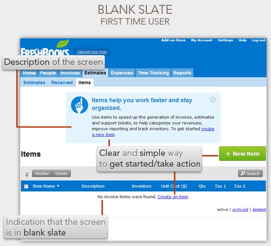
1. Neglecting the Design of Blank SlatesThe blank slate is what a screen looks like when a user hasn’t added any data yet, or when a user deletes all of the data related to that screen. Let’s look at an example of a blank slate — FreshBook’s item estimates screen:
Notice how they have placed some simple elements in the blank slate that greatly enhances the usability of the screen. Namely:
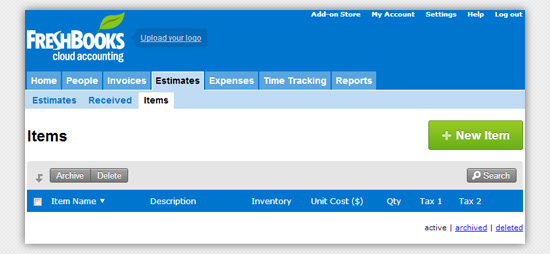
Let’s take out these blank slate design components to see how powerful they are in terms of usability:
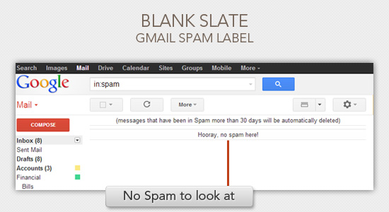
Imagine yourself as a first-time user presented with the screen above. You’re stuck. You don’t know what to do in this screen, and there are no pathways for you to learn what this screen is for (except creating a new item, but you won’t be sure what you’ll be creating and what the outcome will be). What should you show on the blank slate? At the bare minimum, you should have a blank slate indicator. "No invoices found", "No posts scheduled yet", "No photos to display", and so forth.
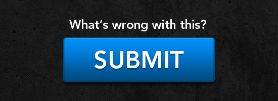
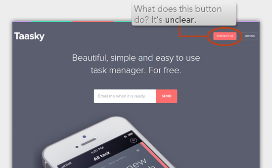
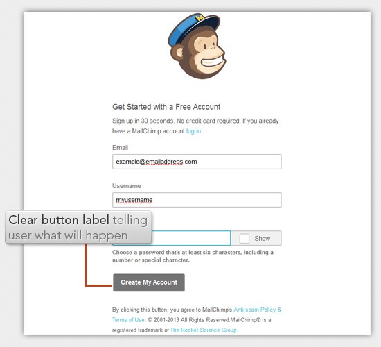
But, to me, the bare minimum of having a blank slate indicator is not good enough. You want to teach new users how to use your software at every possible chance. And your perfect opportunity for teaching them are in these blank slates. 2. Unclear Button LabelsAfter you fill out a form to create an account on a web app, what should the button at the end of it say? It should intuitively say "Create Account." The label on actionable interface elements such as a web button should always tie back to what it will do for the user. These interface elements shouldn’t be unclear, questionable, ambiguous. They should be as obvious as possible. Let me show you how subtle this idea is. Look at the image below, it has an unclear button label.
You might be saying, "How is that unclear? It obviously states the purpose of the button: Contact Us." It’s unclear because the result of pressing the button is not obvious.
In fact, it’s none of the above. What it does is it opens up your default email client:
What’s wrong about that? Here are some usability and user experience issues:
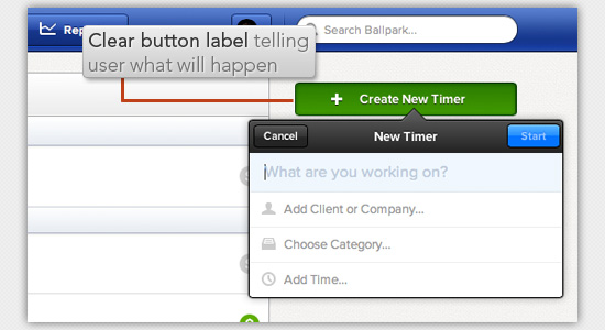
The resultant behavior of the button is not clear. If the button was labeled with "Send us an email" then having my email client open up wouldn’t be as surprising. As a user, I shouldn’t have to take the time to look at the web page to derive the context of what a button will do for me. Why not just spell it out for me? If a button says "Save," I’m forced to look at the rest of the page to figure out what it is saving. But if it says "Save Post" then it’s immediately clear. When setting the text of your web buttons, just ask this question to help you come up with good labels: What will the outcome be after pressing this button? Here are a few examples of clear button labels:
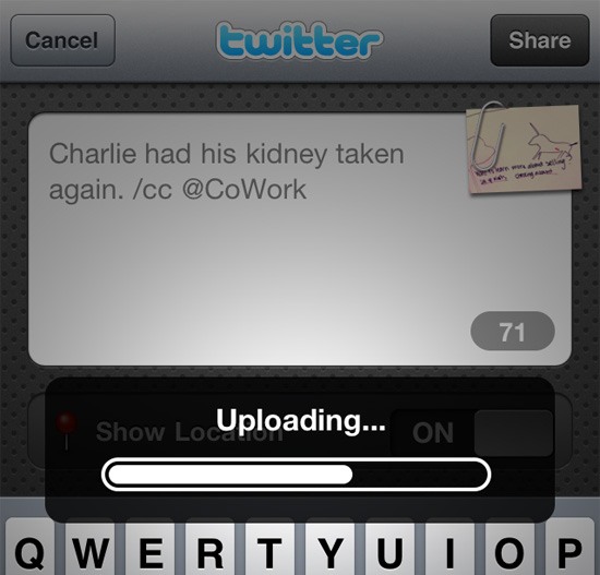
Coming up with good button labels is a simple and quick affair that some of us tend to neglect. Having clear button labels greatly enhances usability. 3. Making Users Wait Without Giving Them Any FeedbackI hate to wait. Especially if it’s for an unknown amount of time. If we were driving down a road together — and you, the driver of our car — pulled over to the side of the road and sat in silence for a minute without telling me why, I’d be annoyed at you. But, if you say, "Hey, I need to pull over for a second because I’m sleepy and I need a short break," I would completely understand and wait patiently. We make users wait all the time in our websites and web applications. We make them wait whenever we’re updating a web page’s content asynchronously, whenever we’re opening a modal window with a very large high-res photo, or when our web server suddenly experiences reduced performance. Making users wait is sometimes unavoidable. But making users wait — without telling them why — is never unavoidable. Any time you’re loading data, updating some content, or otherwise possibly making the user wait, tell them. Display a progress bar or spinning animation along with some text of what’s happening.
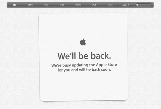
If your site is experiencing uptime issues, tell your users what’s going on:
People will be much more patient with you if they know what is going on. 4. Losing User Inputs in Web FormsOne time, I signed up for a web application. The first thing it wanted me to do after signing in was to fill out my profile information. That’s fine. So I selected a photo, filled out one or two other input fields, and clicked a button to submit my info.
I was surprised when I was brought back to the same page, telling me that more fields were required. But the real issue is that the photo I selected was gone — I needed to select the photo again and upload it. This brings me to the cardinal rule of web form validation: Whatever you do, do not lose my data after validating my inputs. Think of how frustrated your user would be if the form you’re asking her to fill out took a lot of time and, because she just forgot to fill out an input field, she now has to start over. 5. Clickable Areas Are Smaller Than They Appear to BeIt’s important to make sure that elements that appear to be clickable should be clickable. Take a look at the image below to see what I mean:
A reasonable person would assume that the entire tab is clickable, but that’s not the case in the above example. Only the text is clickable. Not the tab. Yes, I know it is atrocious. What makes it worse is that it is a common mistake I see. Why does this happen? It happens because most web designers create tabbed navigation menus using unordered lists ( <ul> <li><a href="">Link 1</a></li> <li><a href="">Link 2</a></li> <li><a href="">Link 3</a></li> </ul> That is good. The mistake happens when they add all the style properties (particularly the padding property) to the Since the This means that for this style of navigation nearly all the CSS should be applied to the nested Also, when styling links (without backgrounds or borders) use padding rather than margin. Padding will give you space between elements as margin does, but will keep the clickable area nice and large. Quick FixesMost of these are really simple things to fix, so if you are making any of these mistakes, go fix them now. If you made it through this article unscathed, congratulations! Just make sure to keep looking at your user interfaces with a critical eye to catch any other usability issues. Your users will thank you. Related Content
About the Author |
| You are subscribed to email updates from Six Revisions To stop receiving these emails, you may unsubscribe now. | Email delivery powered by Google |
| Google Inc., 20 West Kinzie, Chicago IL USA 60610 | |





No comments:
Post a Comment