User Testing for Web Accessibility - Six Revisions |
| User Testing for Web Accessibility Posted: 03 Apr 2013 03:00 AM PDT If you live in a major city, chances are, your buses, trains, and trams are accessible to people with physical disabilities and special needs. Your elevators and sidewalks, too. What about your website? According to Forbes Magazine, people with disabilities represent the largest minority group there is — a $1 trillion market worldwide.
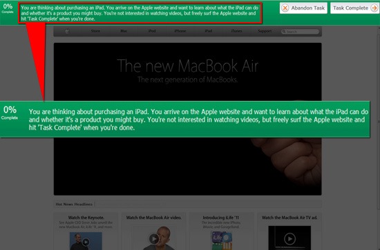
To provide a comparative perspective, consider that the total market for cloud services in 2011 is only $91 billion according to Gartner. The overall market for consumer packaged goods (CPG) in the US, according to McKinsey, is only twice Forbes’ estimate, at $2 trillion; that’s every CPG in the entire country — mouthwash, paper towels, Tide, everything. People with disabilities use the Web in ways I call "smarter than the average bear." There are myriad assistive technologies out there that help solve this challenge. Before we look at usability testing for web accessibility, let’s first discuss how user testing is normally done so that you can have a better view of how user testing for accessibility is unique. Usability Testing 101If you have no experience in usability testing, I’ll give you a crash course now. In a usability test, the researchers watch as a user interacts with a product or website in order to find areas that aren’t user friendly. What you’re trying to understand in a basic usability test is this: Given a task, how many participants can efficiently and successfully complete them? For example, if a university wants to learn whether potential students can easily submit a request for a brochure on graduate programs, they might start by conducting usability tests to learn, quantitatively, how many potential students will be able to complete the task efficiently and successfully. Qualitatively, you can study the results for things you can do to optimize the potential student’s experience of finding a way on the website to accomplish this task. Types of Usability TestingThere are several different types of usability testing. Remote User Testing Remote user testing is a form of usability testing where the tester moderates the test via phone, webcam, or an online tool, rather than being on-site with the user. This is often done with the users scattered across the country (or the world), and budget constraints dictate that the tester find alternatives to conducting in-person tests. Moderated or Unmoderated User Testing Moderated user testing refers to research studies where there’s a live moderator spelling out the tasks the visitors needs to complete. In a face-to-face, moderated test scenario, the tester is typically monitored by a webcam or by live observers. Unmoderated user testing usually gives the user a simple prompt, leaving it up to them to figure out how to do what is prompted. Online User Testing Online user testing describes the use of a web-based tool (as compared to test participants sitting in a room that’s set up just for the test). Example of a Usability TestSay you’re a usability tester. You might see a screen like the one below. This interface is specific to Loop11, my own user testing SaaS company.
In this case, the usability testers were given three distinct tasks to complete:
Say you’re conducting this usability test. Here’s the data you’re ultimately looking for:
You can read more about this experiment here. The Unique Challenges of User Testing for Web AccessibilityNow that you know the basics on how user testing works, you’ll have a better appreciation of the unique set of barriers people with physical disabilities face when they are browsing the Web — a set of difficulties most of us probably haven’t thought much about. Examples of Disabilities That Can Affect a Website’s AccessibilityBelow are some disabilities that can affect a person from experiencing the Web the way most people do.
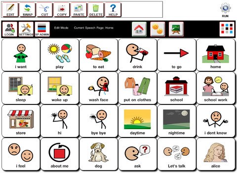
Example of an Assistive TechnologyFor children and adults with autism, one familiar tool is TalkingTILES. It’s a touch-based application — what’s called an "Augmentative & Alternative Communication" (AAC) app — that runs on any major platform and any computer.
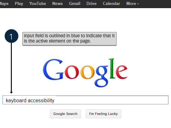
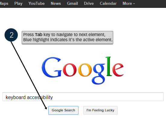
The idea is to empower people with speech or language disorders to communicate with the world around them, and with computers, using symbols and visual words. Basic Suggestions for Minimum Website AccessibilityWhen it comes to user testing, there are a few simple steps we can take to ensure that our site is, at the minimum, able to hook up with assistive technologies. This, in turn, removes common issues from our websites and allows us to focus our tests on things that we would normally have a difficult time discovering without user testing. Use Descriptive Label Elements for Input Elements in Web FormsIf a visitor is using a screen-reading assistive technology that interprets what’s being displayed on the computer screen (designed for visually impaired people), your web forms will be hard, if not impossible, for the person to interact with. Below is an example of an <label for="username">Name:</label> <input id="username" type="text" name="textfield" /> Notice that the Test Site Navigation for Keyboard-Only ScenariosEvery component of your site must be navigable using only the keyboard. Some site visitors won’t have access to a mouse or touchpad, so your site should be accessible via keyboard-only navigation if needed. A rudimentary test: Use the Tab key to see if you can get to all hyperlinks and interactive elements such as links in drop-down menus, Also, check to see if the currently active interactable element is highlighted and visible. Below is the Google search page showing how good Tab key navigation works. The active/focused element is styled using CSS so that it is presented with a blue border.
When you press the Tab key, it goes to the next HTML element. The blue border is removed from the previously active element and is transferred in the currently active HTML element.
The styling and expected behavior is consistent.
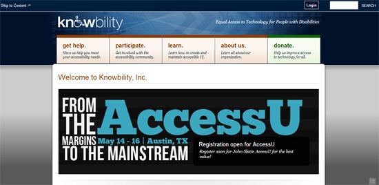
Useful Alt Attributes for ImagesImages on your website that are critical to understanding the content being presented must have a useful Of course, there’s always more you can do as a site owner and the above tips are only a few basic steps you can take to make your website more accessible for people. Example of User Testing for Web AccessibilityWhen we talk about accessibility user testing, we refer to a set of usability studies focused on users who rely on assistive technologies to access web content. The objective is usually to determine whether everyone, regardless of physical or cognitive impairments, can use a website. For a recent project, Knowbility, a non-profit dedicated to increasing technology accessibility, ran an accessibility assessment using our software.
ParticipantsThey recruited participants with special needs for accessing websites so that the researchers can determine what barriers the participants might face in browsing a particular university’s website. The participants consisted of:
Some participants used assistive technologies like screen readers, screen magnifiers, and adaptive technology for motor impairments. FindingsOverall, the site tested could benefit from several improvements, though 6 of the 9 participants concluded the site was easy to use. Not a single participant thought it was difficult to keep track of their current location in the website. They all found navigation, on the whole, logical and well presented. The three main accessibility problems encountered had to do with keyboard use and screen-reader-accessibility.
These findings are often difficult to find without actual user testing. Because it’s one thing to know how to create accessible websites, but it’s another thing to actually witness how people with different abilities use a website. Test Your Own Site Now for Accessibility
There certainly are a lot of considerations in the world of accessibility testing, though this shouldn’t deter web designers and user experience professionals from ensuring websites are built with universal design in mind. Learn More About Web Accessibility User TestingIn 2012, I ran a joint webinar with the good people at Knowbility. You can view the webinar on YouTube and it’s embedded here below. To learn more about broader questions usability testers face, you can also check out my 7-series video called: Online Usability Testing 101. It’s free, but you’ll need to enter your email address. Some other resources and articles on the Web to read:
Related Content
About the Author |
| You are subscribed to email updates from Six Revisions To stop receiving these emails, you may unsubscribe now. | Email delivery powered by Google |
| Google Inc., 20 West Kinzie, Chicago IL USA 60610 | |




No comments:
Post a Comment