Responsive Web Design is Not the Future - Six Revisions |

| Responsive Web Design is Not the Future Posted: 01 Apr 2013 03:00 AM PDT
In 2000, The FWA (a popular website awards program) gave their prestigious Site of the Year award to Look and Feel New Media, shown below. Visit the site for some context of what I’ll be discussing, but turn down your speakers or headphones because it has background music.
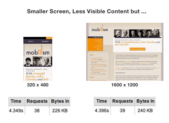
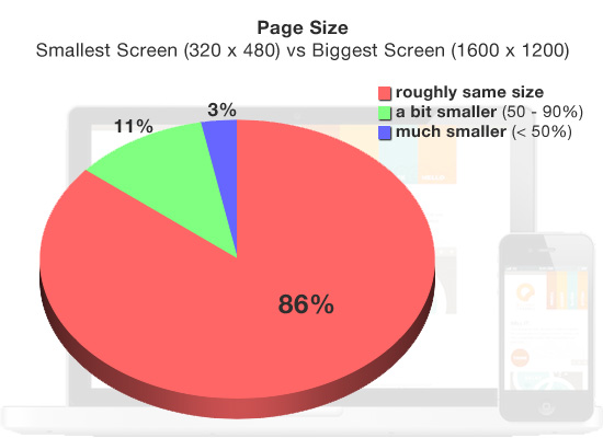
The Look and Feel New Media site is a simple Flash website by today’s standards, but it was state of the art back when Flash was an innovative web technology. Now, thirteen years later, with the capabilities of HTML5 and CSS3 standards, Flash is now on the way to extinction in the sense of, at the very least, modern web design and development. Even Flash technology’s owner, Adobe, decided to discontinue the development of this ubiquitous rich media platform’s mobile version. So what does this have to do with responsive web design (RWD)? Well, responsive web design has gained an enormous amount of momentum since its introduction in 2010 through an article named "Responsive Web Design" published on A List Apart. And the design philosophy’s popularity today is comparable to Flash websites in the early-2000s. Let me state that Flash is a technology, whilst responsive web design is a device-independent design philosophy, so that is not a direct, apples-to-apples comparison. However, it’s a parallel to hopefully open our minds when considering the ever-attractive design philosophy that is responsive web design. Just as HTML survived the Flash versus HTML debate of the last decade, I believe we should not write off other mobile development techniques and alternatives just yet. Below, I will discuss some issues I’ve come to realize with responsive web design (RWD). Web PerformanceResponsive websites are not much smaller in download size when viewed on smaller devices or screen resolutions when compared to being viewed on a desktop browser jacked into a broadband internet service provider. Last year, Guy Podjarny, chief product architect at Akamai tested 347 sites featured on the responsive web design gallery Media Queries using Google Chrome with multiple devices, and the web-based tool WebPagetest. He found that the web page size and load time results were nearly identical regardless of device or screen resolution being tested. The results from Podjarny’s test can be found in his presentation at BDConf. What does that mean? Even though we might view a responsive website on a smaller screen and it displays less visible content or smaller-sized images, this does not mean that the site will load faster.
You might say, "But that’s not a big deal, mobile internet is really fast now." It’s true that mobile networks are becoming increasingly faster. However, mobile internet speeds still lag behind broadband internet speeds. Currently, browsing the Web using a desktop computer is still significantly faster. Last year, the average broadband internet speed was 2.6Mbps[1] versus only 2.02Mbps[2] for the average smartphone mobile network internet speed. The year before, the average mobile internet speed was only 1.18Mbps. In the best-case scenario, broadband internet is still 28.7% faster than smartphone mobile internet. How important is website speed? What types of margins do we have in terms of users being forgiving of even a slightly longer load time? According to Google research, mobile users "expect their mobile experience to be as good as their desktop experience." The infographic by KISSmetrics below shows the dramatic impact of loading time. An e-commerce website making $100,000 per day could actually be losing $2.5 million a year with just a 1-second page delay.
It’s not a far stretch to assume that dedicated mobile web development solutions is going to be more optimized than responsive web design because they specifically address mobile devices. A rudimentary comparison of dedicated mobile solutions versus RWD solutions suggests that this is true. Of course, there are ways to optimize responsive web designs, such as serving smaller images and conditionally loading scripts, but you have to think about the performance ceiling of these optimization techniques compared to developing wesites specifically for mobile devices. Complexity"Blame the Implementation, Not the Technique" is a great article to read. The article, by web developer and book author Tim Kadlec, challenges the stance of some folks that responsive web design is slow compared to other solutions that cater only to mobile devices. The article argues that good implementation of RWD can address most performance issues on the Web. We can probably make most responsive websites load dramatically faster on a mobile screen, but there is no denying responsive web design is inherently complex. When comparing responsive websites to dedicated mobile websites — such as "m dot" subdomains like m.sixrevisions.com — there is no argument when the point of discussion is complexity. A typical "m dot" site is simple. It usually has a small amount of HTML, limited scripts, CSS, and images (if at all). It is built specifically for its intended viewing experience: small-screen, touchscreen mobile devices. And if we were to talk about development time and ease, there are many web tools that can take your site’s RSS feed and convert it to a dedicated, mobile website.
Responsive web designs, on the other hand, are inherently complex because they are trying to support many viewing experiences without necessarily optimizing the experience for one particular device (or genre of devices). Without going into the details, mobile browsers will have to deal with a big HTML file, and the site would need to carefully avoid running specific scripts, loading certain CSS and download large images. Perfect implementation is possible, but avoiding over-resourcing requires scripts or code and therefore additional complexity. A responsive website tuned for best performance would still not be as fast as a dedicated mobile website that’s implemented equally well. Time and MoneyWith a higher level of complexity comes a higher resource cost. With responsive web design, gone are the days of simple mock-ups in Photoshop and a designer’s work is done. Responsive web design workflow is still evolving and is becoming gradually more streamlined, but currently, it’s quite impossible to complete the same website project without increasing the resources you spend.
Borrowing Viljamis’ responsive web design workflow above, you can see the workflow can start to look like Agile development paradigm or use of Scrum development framework. The obvious issues with flexible development philosophies and frameworks has always been a higher resource cost, whether it’s the skills required, the cost required or increased client interaction demands. UI and UX LimitationsThe difference between a desktop user and a mobile user is not only screen size. Responsive websites are limited for utilizing or recognizing key mobile features such as user location, connectivity, device limitations, software potential, and user needs. Yes, there are many ways to create an ideal user interface and experience for several layouts with responsive web design, but there are clear limitations compared to having a dedicated mobile website.
Above, admittedly not the finest example, illustrates straightforward differences between great user experience on mobile devices (left) versus a very average user interface (right) for mobile devices. When a different UI is required for mobile users, responsive web design becomes an obvious secondary choice to me. Brian Fling, author of the book Mobile Design and Development puts it beautifully:
Preventing InnovationThis is the danger in having tunnel vision and claiming responsive web design is the future: innovation in solutions outside of RWD might be overlooked. And outside of RWD, there are innovations that a few companies are reaping the rewards of. For example, the banking giant JP Morgan Chase thought about the specific characteristics of mobile devices that they could use to enhance the online banking experience, instead of simply reformatting their desktop website for mobile customers. Their mobile app has a feature called Quick Deposit that uses smartphone cameras to take pictures for depositing checks.
According to the company, consumers have used this feature to deposit over $4 billion dollars and the app has won several awards including the highly renowned Webby Award in 2011. Google is another good example. Despite their recommendations towards responsive web design, the tech company is into heavily developing mobile-only technology and content. One example is Google Now for Android. It has been called "the jewel of Android 4.2" and it won the Popular Science’s Innovation of the Year.
Google could have made their content responsive and refrained from innovating. But they did not, and their business is better for it. As smartphone sales hit an all time high, should we not be innovating for these devices? Certainly, for types of websites with limited user interaction — such as informational sites, blogs and news sites — responsive web design is a good, and often very practical, solution. But for websites and web apps that want to take advantage of what touchscreen mobile devices offers, can they effectively do so with a responsive web design philosophy compared to native/dedicated mobile site development solutions? Current or Future?
You may be surprised if I told you I love responsive web design, because I do. It definitely has its place on the Web right now. I believe responsive web design is a current trend, but I dare not say it is the future at all. With the rapid growth of the Web and future improvements in screen technology, it would be a folly to label responsive web design as the future. What do you think? How heavily should we invest into responsive web design? References
Related Content
About the Author
|


| You are subscribed to email updates from Six Revisions To stop receiving these emails, you may unsubscribe now. | Email delivery powered by Google |
| Google Inc., 20 West Kinzie, Chicago IL USA 60610 | |
We believe websites with a highly responsive and sleek layout build audience quickly without a lot of effort on the team’s part. The first impression is a huge giveaway Web Design Company make-or-break point which is why we make sure that each aspect of your firm is incorporated seamlessly for people to savour and be invested in.
ReplyDelete