The Making of a Startup’s Mascot - Six Revisions |
| The Making of a Startup’s Mascot Posted: 11 Mar 2013 03:00 AM PDT A few startups choose to have mascots–playful fictional characters that represent the company. Some popular examples of website mascots/characters are Reddit’s alien mascot, AppSumo’s sumo wrestler character and MailChimp’s chimp character. Mascots create a memorable brand experience for your site visitors. In this article, we’d like to share our company’s experience in developing our mascot.
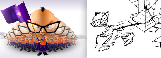
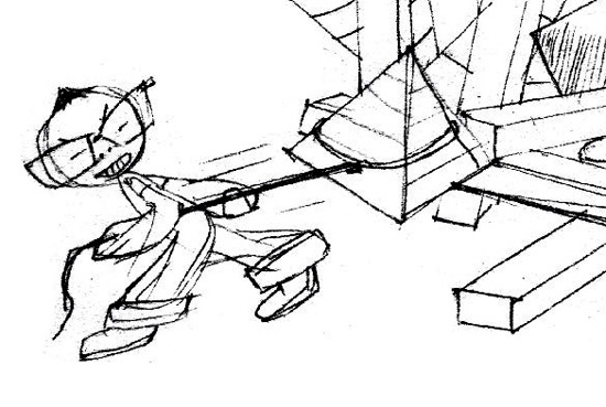
Where the Idea of a Mascot Came FromIt was right after we opened shop in Bangalore, India that the idea of having a mascot first dawned on us. Our company, FusionCharts, has always had a young and fun feel to it — something we had built using our conversational writing style, bright company colors, and easy-to-use products. And all of that worked well for us in terms of acquiring customers and getting talented people to join the company. We were looking to attract the best talent India’s Silicon Valley had to offer, so we had to turn it up a notch. We had to give them a place they would love working for. We got an office in the middle of the startup hub in the city. The office wasn’t particularly big or fancy by itself, but what it was, was cozy. We wanted to add to that intimacy by bringing in a creative agency feel to the place. One of the earliest ideas that came up was to have posters with famous movie dialogs adorning different corners of the office. Movie quotes like, "I’m gonna make him an offer he can’t refuse" for our sales department and "May the force be with you" for the engineering department. We also had this 48ftx2.8ft glass panel running along the length of the office where we wanted to go crazy with creativity. One idea was to have an illustration showing how the world we know — the world of charts — came to be. The sun represented as a pie chart, skyscrapers a column chart and the Pyramids of Egypt, well, a pyramid chart. The central idea behind having all these illustrations was to have a common something that everyone could connect with. Something they would feel emotionally invested in. Something that pushed them to make a dent in the universe. The thinking went: "If the idea is to get everyone to connect emotionally to your brand, why not have a character everyone can relate to?" A character that could tell the sales team to make offers prospects can’t refuse. A character that could orchestrate the big bang we were planning for the glass panel. A character that our engineers could talk to when their code didn’t work the way it was supposed to. The idea of developing a company mascot made sense, and the seeds for the mascot were sown. Before we get into the development of the character, let me tell you a little bit about the design agency we worked with so you have the complete picture as we go into the story. Quirk Brand Communications is a small outfit based out of Bangalore, India (just like us). We’ve been working with them for a year before the mascot gig happened, so they had a good idea of the FusionCharts brand and philosophy. We’ve hung out with them a number of times over beers. They’ve been to our co-founder and CEO’s wedding. "Wait, did you say wedding?" Yes. In short, when a design agency is trying to represent an entire company through a character, the more they know about the company, the better. Defining the CharacterOn to the character itself. FusionCharts’s products are made by developers for developers. So the character had to be a geek. A proud geek. There had to glasses. The clothes had to be casual. The mascot had to portray the numerous traits that we bring to the table: witty, wacky, sharp, crazy, cool. And all of that had be packaged into a distinct style. Initial SketchWith the brief in hand, our design agency got started. Very soon, we had a sketch of the character building the world of charts.
First cut, and we loved what we saw. He had everything we had asked for. The big, exaggerated glasses gave him the brilliantly geeky look we wanted. The hairstyle gave him a distinct individuality. It was a good start. We could imagine him proudly introducing our products to the world, happily hanging out with customers at trade shows and chilling out with us in the lounge. The only problem we had was with his eyes. They were too small to convey the wide range of emotions that would be required for the different messages we wanted him to convey. That’s pretty much the only major change we asked for. The Mascot’s Code NameDuring our back-and-forth with our design agency, we decided to give him an internal name that would make our communication easier. Once we had developed the character completely, we could go find a kickass name for him, but for now we needed something temporary.
We decided to call him The Dude. The Mascot Debuts in the OfficeSoon, our office was ready to be adorned with the glass panel art.
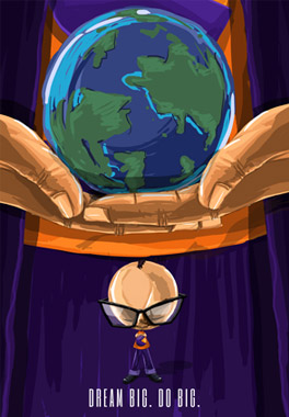
The orange and purple in The Dude’s clothes brought in our corporate colors. The big head added to both the intelligent feel and gave it a distinct personality. Exactly what we needed. Soon The Dude was telling team members to dream big:
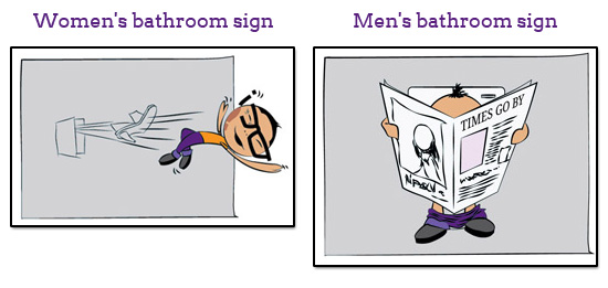
And also telling apart the ladies’ loo from the men’s:
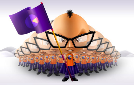
The Mascot Needs a NameThe Dude had taken over the office and was soon going to be a part of our outgoing communication materials as well. But the character had to have a name before it could take over the world. In addition to the traits we had for developing the visuals, we wanted the name to be short and simple. FusionCharts sells in over 120 countries, so it had to be something the world over could pronounce and remember. The best way to do that was make up a word just like anyone starting a company hoping to get a .com domain these days has to. Prodigy, Superboy, Ara, Mateo, Niko, Pablo and Kai were some of the names our design agency offered. All of them were short and simple, sounded powerful yet had that fun geeky touch to them. But, somehow, none of them gave us the this-is-it moment. The agency sent in more names but most of our replies went something like this: "None of them seem to be working for The Dude. We need something better." To which they replied: "Why not just stick with The Dude itself? It’s young, fun, energetic. Short and simple, too." So, The Dude it was going to be. For eternity. Unveiling the Mascot to the WorldThe Dude was going down extremely well internally. The new members joining the Bangalore office loved what they saw of him, and we knew time was ripe to take him to the world at large. We started identifying the communication channels that could be driven by The Dude. And before we realized it, he was all pervasive at FusionCharts — right from our web presence to business cards, corporate stationery to trade show brochures, print ads to presentations. While it was a lot of fun extending the mascot along all these channels, it wasn’t an easy task. Conceptualizing the exact fit for each of these touchpoints was time consuming — the posture, attire, placement, messaging, medium and fidelity had to be carefully thought through. But, in the end, it was well worth the effort and we have The Dude in a whole variety of manifestations today. He introduces people to our team on the website:
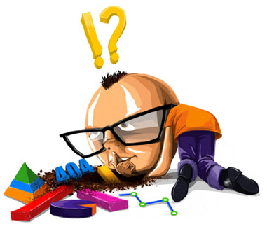
He takes the blame for a 404 error:
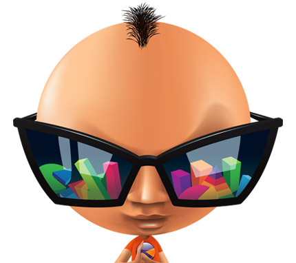
He also wore Men in Black-style sunglasses to tell the world how we power over a billion charts a month:
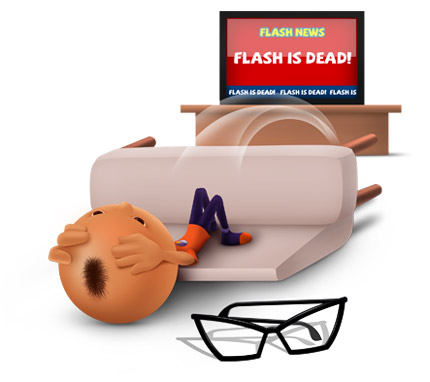
On our tenth anniversary, we wrote a fun book describing the ups and downs of our startup journey. In the chapter talking about how the death of Flash could have been a deathblow for us, he blacks out trying to withstand the shock:
And The Dude also does… The Gangnam style dance:
Tips for Developing Your Own Startup’s MascotMascots are awesome. Can you imagine Linux without thinking about penguins? Twitter without the bird? Evernote without the elephant? Mascots help in establishing a stronger connection with your audience. They bring in a powerful visual element that sums up your brand and makes it much easier for your audience to remember. They develop a fun and relaxed atmosphere that makes your visitors feel more welcome to hang around the website and ask questions. Mascots have a universal appeal. And, as you have seen above, they are very versatile. They can be used to announce new products to the world or simply just telling the men’s bathroom from the women’s bathroom apart. But creating a good mascot is not easy. If done improperly, they can do more harm than good to your brand. What follows are four fundamental pointers that you should keep in mind before you get started with your company’s mascot. Define What Your Company Stands ForThis is a no-brainer. Your mascot is going to be a complete representation of your brand, so you better know everything you want it to stand for. Stunning, reliable, fast, comprehensive — what are adjectives that best sum up your brand? Sexy, maybe? Figure out the Personality and Tone of Your MascotYou can’t make a mascot say, "We are sorry for the inconvenience caused due to our downtime. Our team is working on the problem and will get back to you as soon as they can." Your mascot has a personality, and everything it says has to reflect that personality. Get a Good Design AgencyIf you’re coming up with a mascot, you better do it right. Either commit to investing time and resources into developing your mascot, or don’t do it at all. A poorly done mascot just makes you look cheap. Even though you have that intern who says he can do kickass illustrations, hiring professionals will always be better. Agencies do this for a living and bring in a nice external perspective. Know Where Your Mascot Will Be UsedDetermine which part of your communications goes out from your mascot. We were lucky enough to begin with a mascot and then figure out the strategy. Also, we had rolled out our mascot internally before we put it out to the world, so that helped us with the development of the strategy for introducing it to the public. But it doesn’t work out smoothly like that for everyone. So we suggest that you determine what part of your communications will go out from your mascot, and which part from the people in your company even before you develop your mascot. This might help in the creative direction of your company’s character. Just because a mascot has come in doesn’t mean all of your communication has to go out through it. Your CEO still has his communication skills and his grand visions in place. The Penguin, Bird, Elephant and Alien can’t chair board meetings, plan corporate strategies or sign on your balance sheets. We hope you enjoyed learning about our company mascot. We’d love to hear your thoughts and opinions on the subject. Share them in the comments! Related Content
About the Authors |
| You are subscribed to email updates from Six Revisions To stop receiving these emails, you may unsubscribe now. | Email delivery powered by Google |
| Google Inc., 20 West Kinzie, Chicago IL USA 60610 | |







No comments:
Post a Comment