Design Mistakes We Made in Our iPhone App - Six Revisions |
| Design Mistakes We Made in Our iPhone App Posted: 06 Dec 2012 02:00 AM PST This year at FreshBooks, we released our first iPhone app. Our company’s been around for almost 10 years, and this is truly our first new product since the launch of our cloud accounting web application. We treated the development of our iPhone app like a blank canvas where we could apply some of our team’s most recent design principles. We also wanted to reinforce the lessons we’ve learned during the development our product. But ultimately, the creation of our official iPhone app was an opportunity for us to learn and grow.
Making Mistakes is OKGetting things wrong is inevitable when designing a complex user experience like a mobile app. That’s especially true when you’ve never done it before. As logical as your wireframes may seem, or as beautiful as your mock-ups may look, some of your designs are going to fail when you put them in front of customers. And, believe it or not, that’s a really, really great thing. When we designed the FreshBooks iPhone app, we embraced failure as part of our design process. Embracing failure means these three things:
The net result is a far superior final product and less uncertainty about how it will be received by our customers. So, without further ado, here are three things that we got wrong in our iPhone app and what we did to fix them. iPhone Home ScreenAt the outset of this project, we interviewed a number of existing FreshBooks customers to find out how they already use mobile in their daily lives, the problems they face, and what they’d like to see in a FreshBooks mobile experience. The trends and insights we observed during these interviews ultimately informed a set of design principles. Here’s one design principle we developed from our interviews:
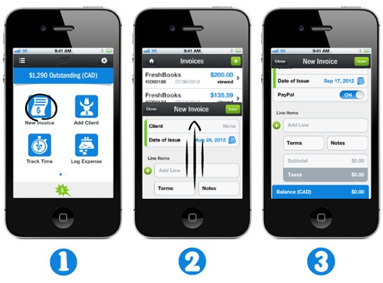
Following this principle, our first iPhone Home screen design for the app comprised of a set of tiles describing important tasks on mobile, such as creating an invoice, logging an expense, tracking time, and so forth. Tapping one of these tiles initiated the corresponding task. This approach was born out of the idea that optimizing around quick creation was essential to a person in a mobile context (e.g., they’ve only got 30 seconds in the back seat of a cab to file their expense). Here’s our original Home screen design:
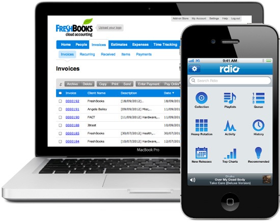
This navigation scheme deviates from typical iOS design patterns, as well as from our own web application. Often, the information architecture (IA) is based on collections (e.g., invoices, estimates, expenses, etc.) rather than their associated tasks/verbs (create invoice, create estimate, log expense, etc.). Below are typical examples of organizing content based on collections.
Our thought was that by orienting the app’s Home screen around tasks instead of collections, it would mean that it’s only a single tap to creating an invoice, logging time, logging an expense, etc., making our app a fundamentally task-centric experience. How We Got It WrongOur beta testers universally found our task-based Home screen orientation confusing. It deviated too far from their existing mental models established by our web application and many other iPhone apps. Here’s a usability-testing video we captured from a person having trouble navigating around our original task-based-oriented Home screen design: Broken mental models: Beta testers struggled with the task-based orientation. Watching the testers interact with the app additionally exposed a flaw in our task-centric design principle. The discrete billing tasks that we identified as important for mobile — creating an invoice, tracking time, logging an expense, etc. — were all fundamentally about creation. We neglected to consider the importance of other categories of tasks, such as:
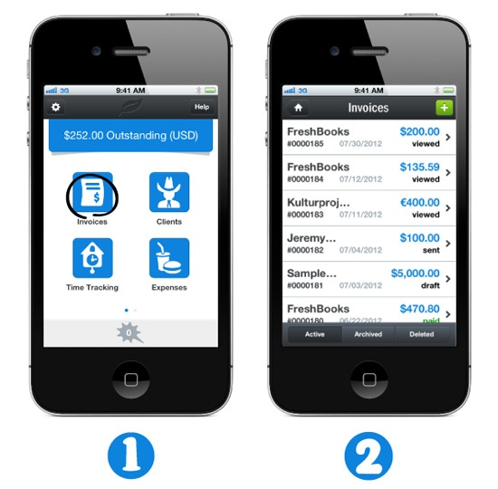
These kinds of tasks were actually more common than creation — especially on mobile, where users were more interested in reviewing and editing rather than creating — yet our design de-emphasized their importance. The SolutionThe solution, in this case, was fairly simple. Adopt the same IA as our core web application. In other words, stick with what works. Here’s the updated Home screen design and what you see when you click on the Invoices icon:
The First Run ExperienceWe created two design principles to guide our approach to our app’s first run experience (what you see and experience when you launch our app for the first time). These design principles are: Mobile First and Frictionless Getting Started. Below are the two design principles in greater detail:
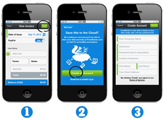
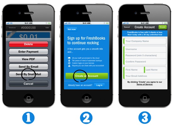
At first, we adopted a very literal application of the Frictionless Getting Started principle in our designs of the app’s first run experience. Before even creating an account or logging in, users were immediately taken to the Home screen where they could start creating invoices, tracking time, logging expenses, and so forth — all within seconds of launching the app. No login or account creation required. This design deferred account creation and login until it presented a relevant benefit to the user. For example, when saving an invoice/estimate/expense, the user was prompted to create an account or log in so that they can back up this data to the cloud — a clear benefit.
Another example: sending an invoice via snail mail.
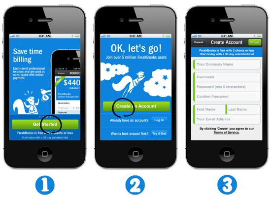
How We Got It WrongThe first run experience suffered from a similar usability issue to the Home screen. Beta testers expected to create an account or login immediately after the launching the app given the ubiquity of this paradigm. Presented with just the Home screen, testers approached the app with hesitation and lots of unanswered questions. Where would their data be saved? To a new account? What if they already have an account? The following video shows the confusion caused by our original first-run experience design: Unanswered questions: A radical departure from a ubiquitous paradigm led to hesitation and confusion. Deferring account creation or login to an opportune time when its benefit is most relevant was novel, but ultimately just too radical. The SolutionAfter further exploration, we determined that the best approach was to immediately present the user with three conspicuous options on first run:
Users who are ready to create an account or log in can do so right away. Those who aren’t ready to commit can tour the app first, with full confidence that they’ll be able to create or connect an account when they’re ready.
Feature Gaps Between Mobile and the Web ApplicationBefore delving into the design, we structured our approach by defining the functional scope for mobile: our minimum viable product. This is important for a few reasons:
As mentioned earlier, we originally assumed that what people really wanted was quick creation of common entities (invoices, expenses, time-entries). As such, when defining the scope of the project, we limited what we were developing to these core tasks. Here are two examples of web application features that were de-scoped for mobile. Settings As our co-founder and UX maestro Mike says, long, complicated settings pages are generally a sign of bad design. The web application has been steadily simplifying and removing settings but we’ve still got a long way to go. Since mobile represented an opportunity to start fresh, we decided to adopt a very minimalist settings experience, even at the cost of removing some of the customization available in the web application. Reports Accounting Reports (e.g. Profit and Loss, Accounts Aging, etc.) are an essential part of FreshBooks’ core value proposition of Cloud Accounting. However, accounting reports have a well-defined format that isn’t easily adapted to the mobile form factor. Ultimately, we decided that reports were best left to the web application where viewing reports will be much more common and can be better supported. How We Got It WrongDeferring accounting reports to the FreshBooks web application was problematic for beta testers who had no prior experience or knowledge of said application (i.e., the "mobile first" users). The absence of Reports on mobile meant that we didn’t meet their expectations of a full-featured accounting app. In a real-world scenario, this apparent feature gap could easily dissuade users from engaging long enough to realize Reports were, in fact, a free feature available in the web application. The SolutionStill, the problem of presenting readable financial reports on a mobile device was not easily solved. But this was not the problem that needed solving. It turns out beta testers didn’t want to actually view Reports on their phones, they merely wanted assurances of their existence before proceeding with the trial. Reports, then, became just another opportunity to convey the benefit of creating an account and connecting to the FreshBooks service.
Bottom LineFreshBooks literally exists because its first user and co-founder, Mike McDerment, was frustrated one busy afternoon in 2003 when he accidentally saved over an invoice and lost his work. Recognizing that potential failure and frustration is a part of every user’s experience is the first step toward creating better products. Every design project at FreshBooks starts with empathy for our customers; it is the fundamental principle that drives everything we do. Related Content
About the Authors |
| Announcement: Winners of DesignBoost Subscriptions Posted: 05 Dec 2012 11:26 PM PST We had a giveaway of five subscriptions to DesignBoost that will give the winners access to all of DesignBoost’s online courses for an entire year. Read on to see who the winners of the giveaway are.
The WinnersHere are the winners of DesignBoost subscriptions:
Congratulations to all the winners! The winners should’ve already gotten an email from me with information about their prize. About DesignBoostDesignBoost courses will help you make your idea come to life using online design training classes. These classes include HD video training, worksheets and design files that are specifically designed to give you the quickest path to an awesome, custom designed product. All classes are designed so that they can be completed by carving out 3 hours a day for 7 days. Check out DesignBoost’s list of available courses. They also have a collection of free courses. DesignBoost is by Jen Gordon, an author here on Six Revisions. Related Content
About the Author |
| You are subscribed to email updates from Six Revisions To stop receiving these emails, you may unsubscribe now. | Email delivery powered by Google |
| Google Inc., 20 West Kinzie, Chicago IL USA 60610 | |




No comments:
Post a Comment